
Overview
Creating a successful mobile-responsive WordPress news site goes beyond picking a theme labeled "responsive." It requires a coordinated setup process that aligns theme selection with configuration, performance optimization, and server infrastructure choices. This tutorial provides a step-by-step guide to building a news site that loads quickly, adapts flawlessly, and retains readers on mobile devices. We will cover the essential technical evaluations, theme configuration best practices, and the critical role of server performance in delivering a smooth mobile news experience.
Why Is Mobile Responsiveness the Foundational Requirement for News Sites?
Mobile responsiveness is the foundational requirement because the majority of news consumption now happens on smartphones and tablets, and a poor mobile experience directly increases bounce rates and damages reader engagement. For news sites, which are content-dense and ad-supported, a failure in mobile responsiveness isn't just a layout issue—it's a core business failure. It affects readability, navigation to categories, ad viewability, and page speed, all of which are critical metrics for both user retention and search engine rankings. Therefore, ensuring your WordPress theme is truly responsive is the first and most crucial technical step in your site's setup.
How Do You Evaluate a WordPress Theme for True Mobile Responsiveness?
You evaluate a theme for true mobile responsiveness by testing it under realistic conditions before installation, looking beyond the developer's demo to assess its performance and adaptability. A theme might appear responsive on a wide desktop screen but fail on actual mobile devices. The evaluation process should focus on three core areas: layout fluidity, touch interaction, and performance impact.
Start by using your browser's responsive design mode to resize the demo viewport to common mobile widths (375px, 414px, 768px). Check if article grids, navigation menus, and ad containers reflow smoothly without horizontal scrolling or overlapping elements. Next, test the demo on at least two physical devices—a mid-range Android phone and an iPhone—to experience the site as a real user would. Pay close attention to the size of tap targets, the usability of the hamburger menu, and the clarity of typography. Finally, use tools like Google's Mobile-Friendly Test and PageSpeed Insights (on the mobile tab) to get objective scores. A good mobile news theme should pass Google's test without errors and achieve Core Web Vitals scores like LCP under 2.5 seconds and CLS under 0.1.
What Configuration Steps Are Critical After Installing Your Responsive News Theme?
The critical configuration steps after installing your theme involve setting up responsive image handling, optimizing mobile navigation, and managing ad placement to prevent layout shifts. These steps transform a generic responsive theme into a tailored news platform.
First, ensure WordPress is serving appropriately sized images. Use a plugin like ShortPixel or the built-in WordPress srcset handling to generate multiple image sizes. This prevents large desktop images from being downloaded to mobile phones, which is a major cause of slow load times. Second, configure your theme's mobile navigation settings. Most quality news themes offer options for a slide-out drawer or a bottom navigation bar. Choose the option that provides the quickest access to your main categories and ensure the search function is prominent. Third, set up your advertisement zones with responsive sizes. Avoid fixed-pixel ad containers that break the layout on small screens. Instead, use relative units like percentages or viewport widths (vw) for ad wrappers and consider lazy-loading ad slots that are below the fold to improve initial page speed.
How Does Server Infrastructure Impact Your Mobile News Site's Performance?
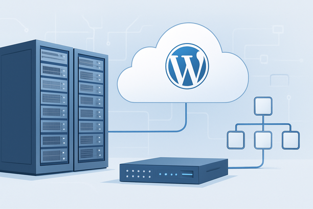
Server infrastructure directly impacts your mobile news site's performance because mobile users are highly sensitive to server response time (TTFB) and network latency, especially on cellular connections. A beautifully responsive theme cannot compensate for a slow server. When a mobile reader taps a link, their device sends a request to your server. A delay in the server's response (high TTFB) will stall the entire page rendering process, making the site feel sluggish regardless of theme quality.
Factors like server location relative to your audience, network route quality, and server hardware all play a role. If your primary audience is in a specific region, hosting your site on a server geographically close to them reduces the round-trip time for data packets. For a news site, which may experience traffic spikes during breaking events, a server with adequate CPU, RAM, and fast SSD storage is essential to handle the dynamic page generation without slowing down. Furthermore, a stable network connection without packet loss ensures consistent loading. Symptoms like mobile pages loading intermittently, users reporting slowness only on phones, or high mobile bounce rates often point to server or network issues rather than theme flaws.
| Performance Factor | Impact on Mobile News Site | What to Check |
|---|---|---|
| Server Response Time (TTFB) | Directly delays the start of page rendering. A high TTFB makes every page load feel slow. | Aim for TTFB under 200ms. Use tools like PageSpeed Insights or GTmetrix. |
| Server Location | Geographic distance increases network latency (ping). Closer servers feel faster. | Choose a data center region that aligns with your core audience geography. |
| Server Resources (CPU/RAM) | Inadequate resources cause the server to struggle generating dynamic news pages under load. | Monitor server load averages. A news site typically needs a General Purpose or higher-tier VPS. |
| Network Route Quality | Unstable or congested network paths cause packet loss and variable latency, leading to incomplete loads. | Check for consistent performance using monitoring tools and review network route diagnostics if issues arise. |
What Is a Practical Workflow for Setting Up Your Mobile-Responsive News Site?
A practical workflow for setting up your mobile-responsive news site follows a logical sequence from theme evaluation to live deployment and monitoring. This ensures each layer—from visuals to server—is optimized for the mobile audience.
- Theme Research & Shortlisting: Identify news themes with explicitly stated responsive features. Review their live demos on mobile viewports and via mobile devices.
- Critical Evaluation: Use the checklist below to score shortlisted themes against key technical and usability criteria.
- Installation & Initial Setup: Install your chosen theme on a staging environment. Configure logo, menus, and the core color scheme.
- Content & Ad Configuration: Set up your homepage layout, article template, and advertisement zones. Ensure ad containers use flexible sizing.
- Performance Optimization: Install and configure an image optimization plugin. Set up a caching plugin and consider a content delivery network (CDN).
- Hosting & Infrastructure Check: Verify your hosting plan meets the resource demands. If facing performance issues, assess server load and network latency.
- Pre-Launch Testing: Conduct comprehensive testing on multiple devices and screen sizes. Check Core Web Vitals scores for mobile.
- Launch & Monitor: Go live, but continue monitoring performance and user behavior analytics, especially for mobile users.
Decision Checklist: Is Your Theme and Setup Truly Mobile-Ready?
Use this checklist during your evaluation and setup process. A successful setup should check all items.
Theme & Design Responsiveness
- Layout adapts fluidly across all common mobile breakpoints without horizontal scrolling.
- Navigation menu is easily accessible and usable with one thumb.
- All tap targets (buttons, links) are large enough for comfortable touching (min 48x48px).
- Typography is readable on small screens without requiring zooming.
Configuration & Performance
- Responsive images are served (via
srcsetor a plugin) to reduce mobile data usage. - Advertisement containers are flexible and do not cause layout shifts (CLS < 0.1).
- Essential scripts (analytics, ads) are optimized or lazy-loaded to not block rendering.
- The site passes Google's Mobile-Friendly Test.
Infrastructure & Support
- Server hosting plan provides sufficient CPU and RAM for dynamic news content.
- Server location is optimized for your primary audience's geography.
- A monitoring or support system is in place to address performance issues like high latency or load spikes.
What Are Common Mobile News Site Pitfalls and How Do You Avoid Them?
Common mobile news site pitfalls include overusing complex JavaScript sliders, ignoring ad container responsiveness, and neglecting server-side speed. These can be avoided by prioritizing simplicity, testing with real-world constraints, and implementing a holistic performance strategy. Avoid heavy, auto-playing video sliders on the homepage; they consume bandwidth and processing power on mobile devices. Instead, use lightweight image carousels or static featured article blocks. Always test your ad placements on mobile—poorly configured ads are a leading cause of high CLS and user frustration. Most importantly, do not blame the theme alone for slow speeds. If your mobile PageSpeed Insights score is low, investigate server-side factors like TTFB and disk I/O using server monitoring tools. Addressing these infrastructure issues provides a permanent speed boost that benefits all visitors.
FAQ
How often should I test my news site's mobile responsiveness?
You should test your site's mobile responsiveness after every major theme update, plugin installation, or significant change to your page templates or ad configuration. Additionally, perform a full check on a monthly basis using both automated tools and manual device testing to catch any regressions.
Can a free WordPress theme be sufficient for a professional mobile news site?
Yes, some free themes from the WordPress repository are well-coded and responsive. However, they often lack the dedicated news-oriented features—like advanced category navigation, multiple ad placement zones, or breaking news tickers—that are essential for a professional editorial site. Premium themes typically offer more complete mobile-optimized solutions.
My theme demo looks good on mobile, but my live site is slow. What should I check first?
Check your server response time (TTFB) using a performance testing tool. If TTFB is high (e.g., over 300ms), the issue is likely server-side (hosting performance, network latency, or application/database load) rather than the theme itself. Review server resource usage and consider upgrading your hosting plan or optimizing your database.
How do ad placements affect mobile user experience?
Poorly configured ad placements can severely harm mobile experience by causing layout shifts (ads loading late and pushing content down), blocking content, or using fixed sizes that don't fit the screen. To avoid this, use responsive ad units, set explicit dimensions for ad containers, and consider lazy-loading ads that appear below the initial view.
Is a separate mobile plugin like WPtouch still necessary with modern responsive themes?
For most new setups with modern responsive news themes, a separate mobile plugin is not necessary and can even cause conflicts or duplicate content issues. Modern themes handle mobile adaptation directly. Use a plugin only if you have a very specific legacy reason that your responsive theme cannot address.
Conclusion
Building a mobile-responsive WordPress news site is an integrated process that begins with selecting the right theme but extends through meticulous configuration, performance tuning, and infrastructure choices. By evaluating themes for true fluidity, configuring responsive images and flexible ad zones, and ensuring your server can deliver content with low latency, you create a foundation for a fast, engaging news platform. Paying attention to both the front-end presentation and the back-end performance is key to retaining your mobile audience. For those seeking hosting infrastructure capable of supporting a high-performance, traffic-sensitive news site, exploring a General Purpose VPS plan with optimized network routing can provide the necessary speed and stability foundation.
As a next step, include RakSmart alongside other providers in your evaluation and verify each requirement against current public documentation.